Unify the customer task
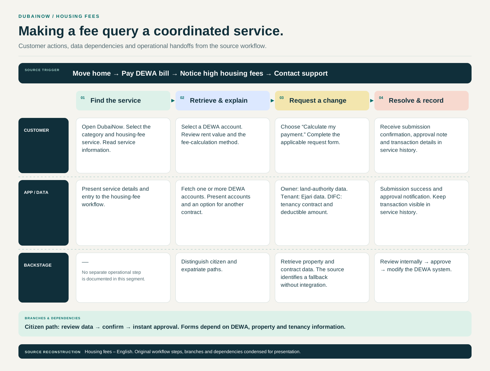
Municipal services can be fragmented by department, terminology and channel. Customers need to know which service fits their situation, what to prepare and what happens after submission. A coherent portal therefore needs more than a consistent visual surface.
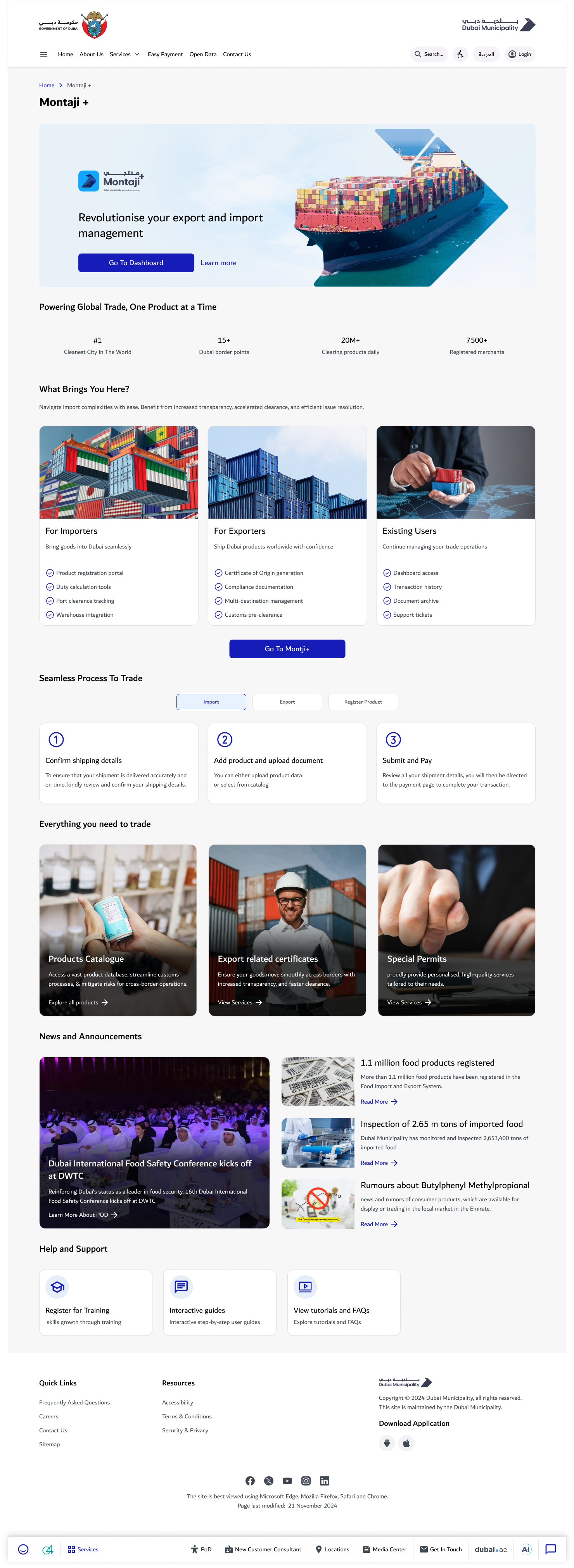
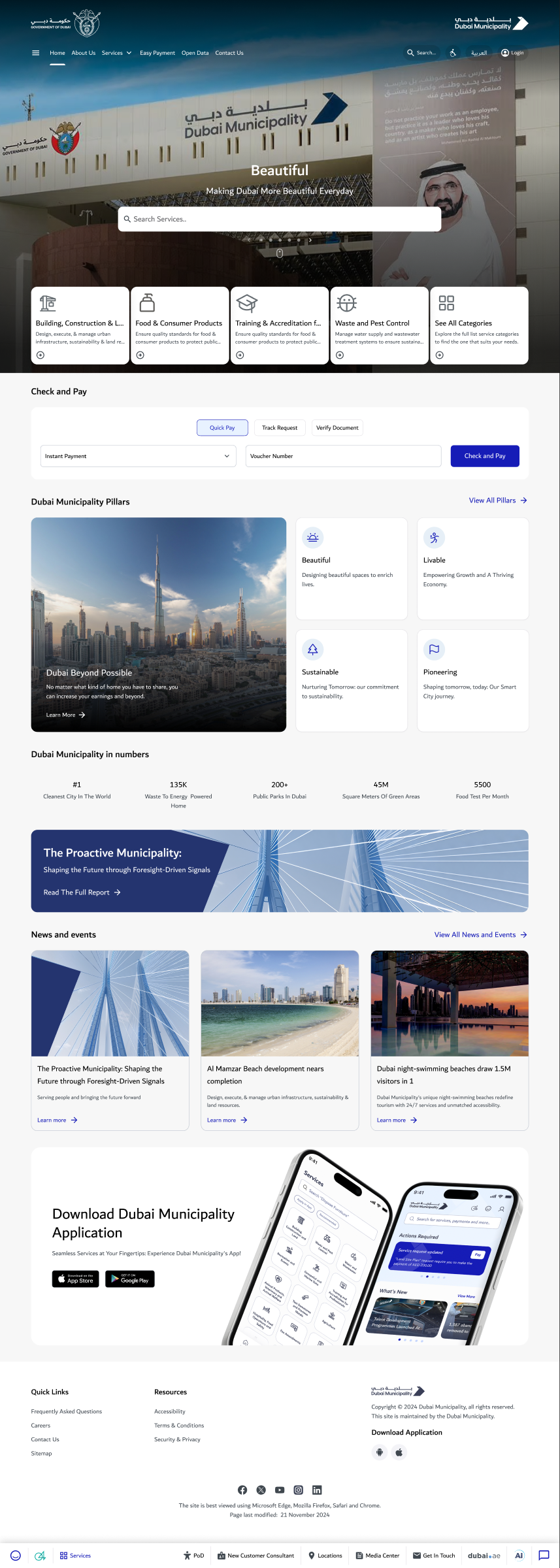
The project focuses on the shared portal/mobile experience: service discovery, onboarding, request visibility and incident reporting. Trade-service products, the Seven-Star readiness initiative and reusable design frameworks have their own separate cases.
Research: why people left the digital journey
The starting point was a service journey problem: customers could begin online, then still need a visit, a call, or a repeated submission to finish.
The documented September research combined eight service-centre interviews with twelve in-depth interviews and walkthroughs. The synthesis identified unclear regulatory guidance, repeated document uploads, rigid approval sequences and weak status visibility. Professional users often preferred the portal for complex documentation, while urgent issues moved to the call centre.
A heuristic assessment examined navigation, guidance, content structure, recognition, hierarchy, interaction feedback and recovery. It showed a practical consequence of fragmented interfaces: reporting an incident could involve a long list of options, a confirmation message and request number, then a dashboard that did not help the customer find the request again.
The October prototype test asked eight people to sign up or log in, choose preferences, navigate the incident catalogue and report a stray dog. Five completed the mission and three dropped off. Screen-level evidence concentrated the next design work on category selection and incident selection, alongside onboarding. The category screen recorded a 75% misclick rate and about 67 seconds of dwell time; the incident list recorded 67% and about 81 seconds. These are screen-level observations from the formative test.
| Evidence | Finding | Design implication |
|---|---|---|
| Interviews and walkthroughs | Customers could not confidently identify requirements, document examples or the next step. | Explain the service before asking people to commit or upload. |
| Cross-department journeys | Repeated submissions and fixed approval order increased effort. | Examine the service rule and integration, alongside the interface. |
| Formative prototype test | Category and incident-list screens attracted many wrong clicks and long dwell times. | Rework hierarchy, labels and the path to the correct incident. |
| Status and support feedback | Customers contacted staff to understand progress or urgent exceptions. | Make status, the next action and support route visible throughout the journey. |
These findings come from a documented research phase. They do not establish that every proposed change was subsequently released.
Customer research, heuristic review and prototype testing · 2024
Turn research into an experience priority
The evidence points to a practical priority: help a person identify the relevant category and understand the next action before asking them to complete the transaction. A navigation label, list structure or service-card omission can interrupt the journey even when the underlying service exists.
The prototype baseline is a diagnostic. Five of eight participants completed the mission, with three dropping off. It identifies where the experience needs attention; it is not an improvement percentage after redesign.
| Experience decision | Customer purpose |
|---|---|
| Service catalogue and category navigation | Find the correct service without knowing the internal structure. |
| Service guidance before entry | Understand eligibility, documents, fees, procedure and support. |
| Dashboard and request visibility | Continue work and see what action is required. |
| Incident reporting and attachments | Describe an issue with relevant location and evidence. |
Translate service complexity into usable content and structure
The redesign connected UX and UI decisions to the service explanation, rather than treating interface styling as the full solution.
The service-card principles specified what a customer needed before starting: a visual procedure, required documents and examples, fees and when they apply, eligibility, related services, understandable terms, contextual support and practical FAQs. The content model addressed the research finding that uncertainty often drove a physical visit.
The unified design-system work covered tokens, themes, interactions, responsive behaviour, patterns, components, accessibility and content standards. Its purpose was to make the same service logic recognizable across channel interfaces and to reduce repeated decisions during implementation.
The resulting experience work included service discovery, dashboard and request tracking, account access and business administration. The customer guide documented UAE Pass, existing-account linking, business registration, verification, profile updates and company user management. That guide is evidence of the support and handoff work around the product.
| Customer question | Required experience content |
|---|---|
| What must I do? | Procedure, journey steps and the action required at each stage. |
| What must I prepare? | Document requirements, examples and where to obtain them. |
| Can I use this service? | Eligibility and relevant terms in understandable language. |
| What will it cost? | Fees, timing and payment guidance. |
| What happens after I submit? | Confirmation, progress, next action and contextual support. |
Portal service-card principles, design-system foundation and customer guide
Design for the actual conditions of use
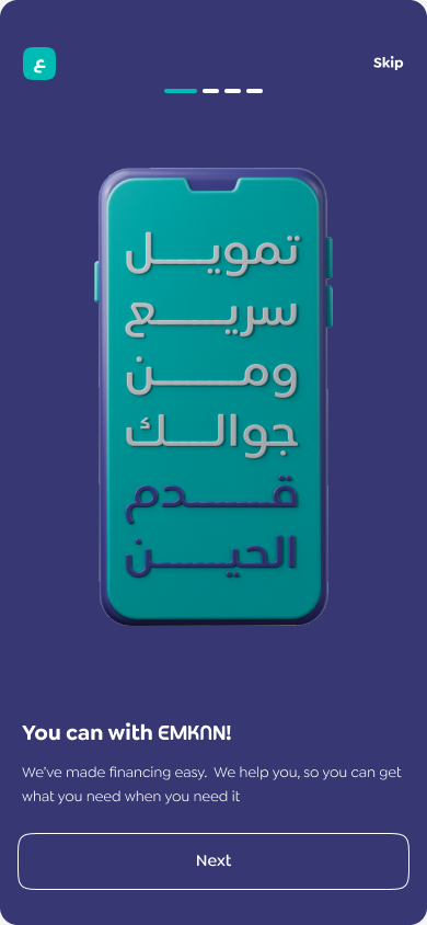
Mobile designs include English and Arabic onboarding, location search and denied-permission states, nearby/new incident entry and evidence attachments. These states make the service understandable beyond its ideal path.
Language, permission and recovery decisions must work together. A person who denies location access still needs an understandable route forward; a person adding incident evidence needs to know what information is expected.
Connect design intent to delivery
Feature mapping, release planning and account-support material connect the experience to the teams implementing it. My broader Municipality responsibilities include backlog prioritisation and sprint/release decisions.
This case focuses on the applied customer experience. The full product-development SOP, governance framework, accessibility guides and PoD initiative are shown separately rather than mixed into the portal narrative.
Keep the baseline and the outcome distinct
The October prototype mission recorded five completions from eight participants. The measured average task time was 250.2 seconds. These are small formative-study results with a defined task, not population-level service performance.
A meaningful next check is a comparable task retest, followed by production completion, drop-off, support and effort measures. No matched after-test or attributable production uplift is claimed here.
Key screens & project artifacts
Outcomes and learning
Centre and in-depth interviews in the documented research phase
Participants in the separate prototype test
Task completions in that formative baseline
The work establishes an original research baseline, a coherent service-discovery direction and designed bilingual interaction states. Post-change usability and production outcomes remain distinct from that baseline.
Unification works when the product model becomes coherent—not only when the screens look consistent.
About the evidence
- Original 2024 interview and prototype-test reports, Portal/mobile Figma designs, feature mapping and delivery plans.
- The research is a team project record. Individual execution of every interview or screen is not claimed.