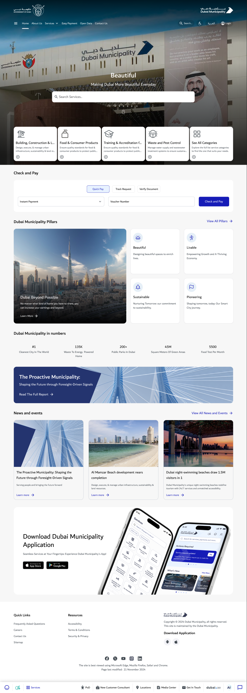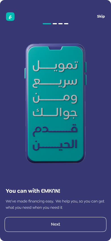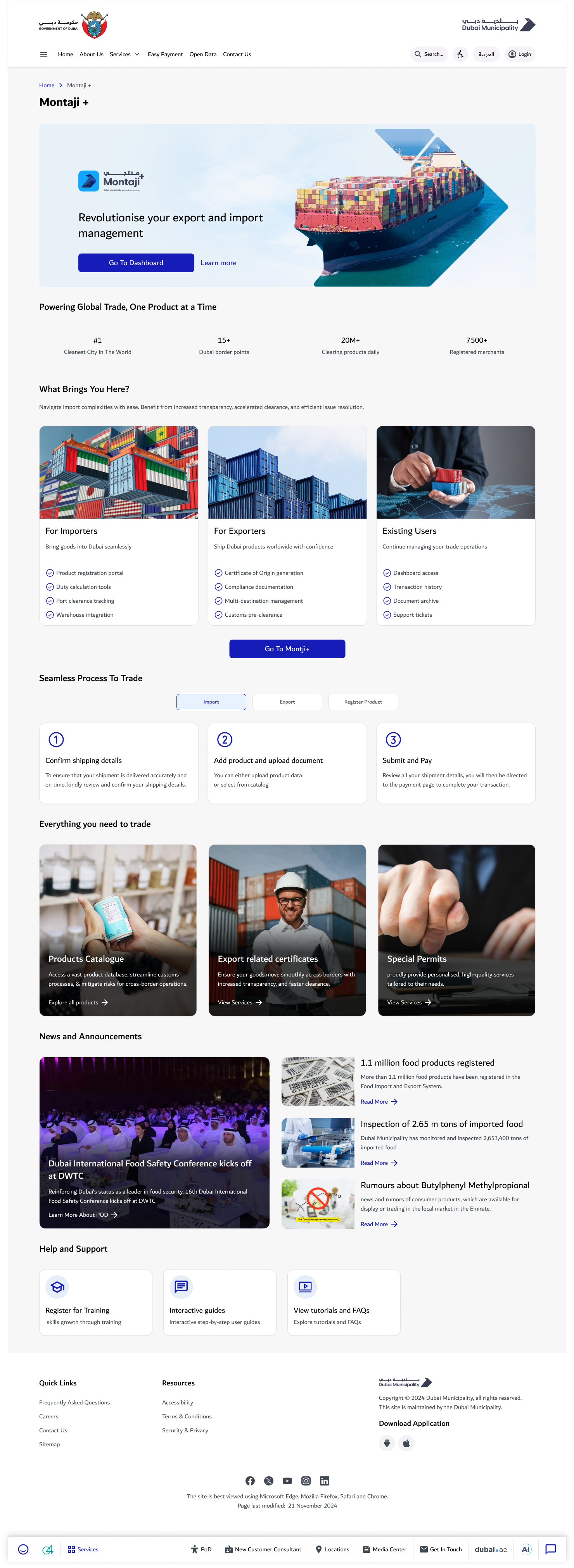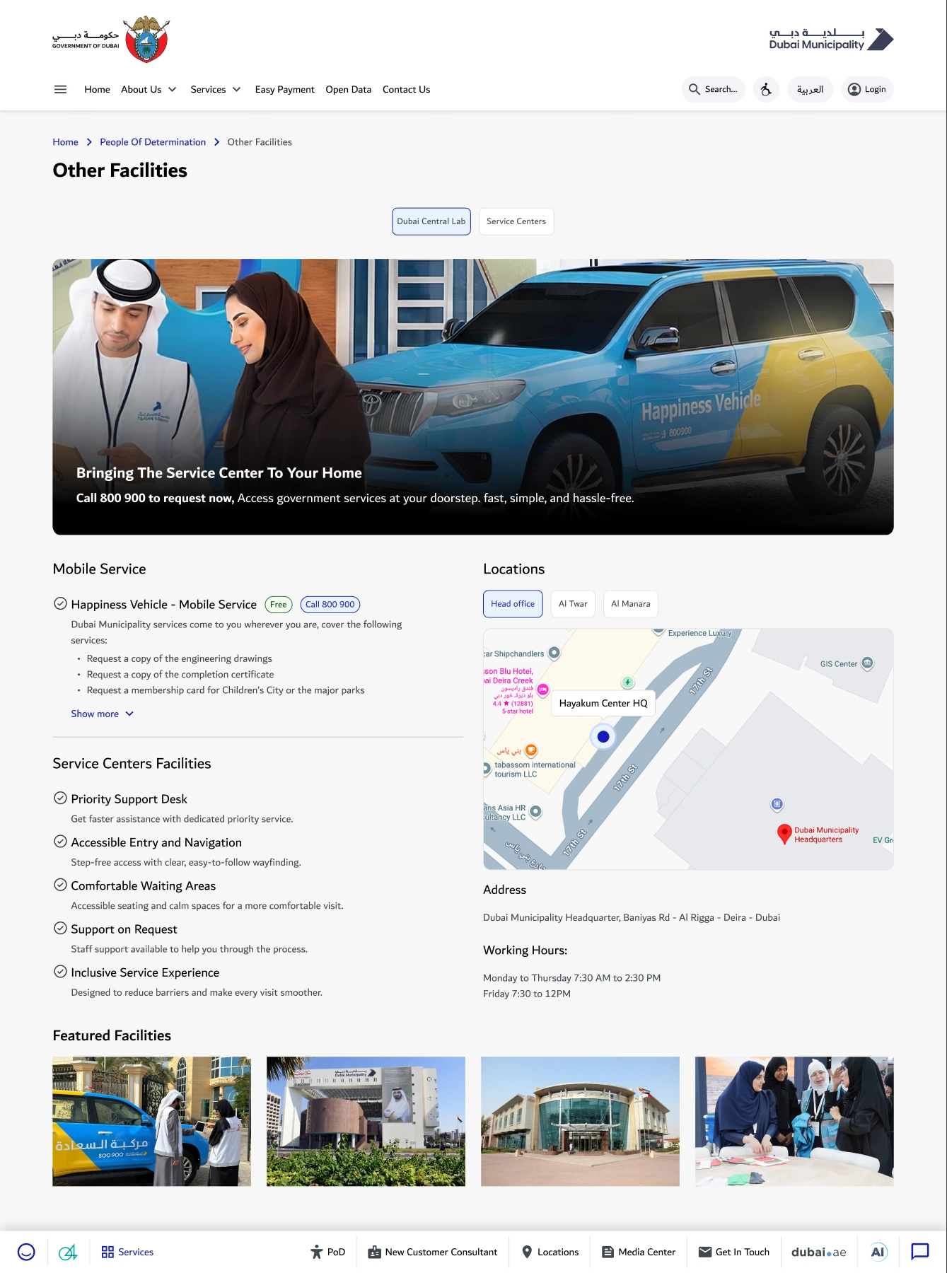
Inclusion begins with information and confidence
The separate PoD Slides page records feedback themes about awareness of available support, accessible communication, guidance, complaint channels and participation/co-design. Those needs extend beyond the appearance of a page.
People need to understand what assistance exists, where a service/facility is, what to expect and how to communicate or ask for help. The case focuses on that applied service and facility information experience.
Bring scattered information into a coherent experience
Original designs cover home, beaches, parks, laboratory, service-centre and entertainment information. The layouts combine facility context, available support, location and next-action content.
An information structure can reduce uncertainty before a visit or service interaction. The source-derived need-to-component table below is an explanatory interpretation; exact historical research-to-screen decision attribution is not implied.
| Feedback theme | Design component |
|---|---|
| Awareness of available assistance | Centralised service/facility information. |
| Communication options | Clear support and contact paths. |
| Physical/service expectations | Facilities, access and assistance information. |
| Feedback and participation | Visible complaint/feedback and participation routes. |
Resolve language and device context
The original Figma page contains English desktop, 390px mobile and Arabic/RTL desktop counterparts. Content hierarchy and navigation must remain understandable when language direction and available space change.
My own 1 October progress update records UX/UI completed with RTL layout change, translation and responsive design. It also records internal evaluation completed with a minor request.
Review content and accessibility separately
A readable inclusive-service layout still needs verified content and applied accessibility testing. Some source layouts contain placeholder or inconsistent location labels; they are not published as verified facility facts.
Keyboard, focus, screen-reader, contrast, content comprehension and Arabic/mobile tasks require test evidence. The general PoD framework and designer/developer guides are separate reusable methods, not automatic proof this experience conforms.
Use a specific task and cohort
Useful evaluation asks whether people can find the relevant support, understand what is available and take the correct next step. Include assisted-technology and communication needs in that task definition.
The slides contain reported 2023–2025 trends without established comparable denominators in the bounded review. Those trends are not personal design uplift or a before/after measure for the October 2026 work.
Key screens & project artifacts
Outcomes and learning
The supported result is a family of original bilingual/responsive designs and a dated internal-evaluation status with one minor request. Production release, closed remediation and measured user impact are not asserted.
About the evidence
- PoD applied designs, separate PoD Slides and original own October task-status message.
- Survey themes support context; no fabricated PoD participant count, compliance certificate or attributable uplift is claimed.